By Patrick F. Cannon
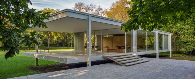
The picture up there is of the 1951 Farnsworth House in Plano, Illinois, designed by the German American architect, Ludvig mies van der Rohe. The image was taken by my collaborator on eight books on Chicago area architects and architecture, James Caulfield. The Farnsworth is unquestionably one of the most famous houses of the 20th Century. It was designed as a weekend getaway for Chicago physician Edith Farnsworth.
As you can see, the house is surrounded by trees on three sides: the fourth faces the Fox River. The opening to the river was originally narrow, so you would be unlikely to get much of a view as you went floating by. One can imagine Edith and her friends cavorting in the nude, with no one the wiser (I’m not suggesting that they did, but who knows?). The point is: if you’re going to have a glass house, this is the place to have one.
(By the way, as you can see, the house is elevated on stilts to protect it from occasional flooding of the Fox. As it happens, it wasn’t high enough and has been seriously damaged on at least two occasions.)
Now imagine if you can that the Farnsworth House has been magically raised from its bucolic site and set down in the middle of a block of charming older homes in Chicago’s Lincoln Park, Old Town, or Wicker Park neighborhoods. Impossible, you say. No one in their right mind would put a glass house in a charming neighborhood of period houses. Guess again. Chicago – and other cities – are suffering from what I would call the “Cubist Invasion.”
As it happens, young architects are taught and presumably believe that their designs should consider the building sites “context,” which simply means its location and what may already be there. I’m sure they wholeheartedly agree that context is important, right up to the point they are given an empty lot and an owner who wants a “modern” statement house. These days, what that means are variations of the cube and rectangle, with really big windows. Exterior materials are usually some kind of concrete, or metal panels. Colors run the gamut from white to off white to sometimes beige, but the bolder might throw in an accent in a primary color to make the invasion complete.
Just the other day, I passed a cubist exercise with a vast two-story window exposing a truly impressive glass-treaded staircase, seemingly supported by some hidden power. Could you descend such a miracle in your jammies? Or do you need a white tie and tails? Presumably, back stairs are provided for the slovenly?
Some architects are respectful of the neighborhood context. It may be just a choice of materials – warm brick or stone instead of grey concrete or white stucco. And what happened to the sloped roof? After all, it does snow here. And don’t get me started on the tall buildings that turned the charming North Michigan Avenue into just another high-rise canyon. Thank God for Paris, where the center of the city retains its height limits and charm; and where steel and glass are banished to the outskirts.
I’m not opposed to modern architecture. Far from it. But everything has its proper place. Edith Farnsworth found it for her weekend getaway. But how would it look on Astor Street?
Copyright 2024, Patrick F. Cannon

Yale did something like that in New Haven, when in the 1960s it erected a brutalist eyesore on its campus in the guise of its school of architecture. The building has suffered several modifications (including a fire) since, but it still sticks out like an affront, which was probably the general idea. The university itself followed suit.
Closer to home, Indiana University now proudly features its own Mies van der Rohe building for its architecture school. Apparently Mies penned the design in the 1950s as a frat house, but it was never used (a clear head must have pointed out its impracticality — very hard to cavort naked in one of these) and subsequently was forgotten in some closet.
https://www.architecturalrecord.com/articles/15519-mies-van-der-rohe-redux-the-eskenazi-school-of-art-architecture-design-by-thomas-phifer-and-partners
When I first saw it, my first thoughts were that it looked a heck of a lot like the Farnsworth House. It’s located near other modern buildings (Library, School for International Studies, Musical Arts Center, I.M. Pei Art Museum) so it doesn’t violate the surroundings. It just looks unsubstantial — again, probably the general idea. Considering its cost, it comes across as an indulgence in architectural snobbery. In contrast, the modernist buildings in nearby Columbus are far more purposeful and original but also complement the design ethic of the town.
Sometimes less is just less.
LikeLiked by 1 person
Interesting about the Mies building at IU. Does look like Farnsworth. I happen to know the author of the article a bit. He’s head of architectural history at IIT, much of which was designed by Mies, so he’s a true believer. The Yale building is by Paul Rudolph, and is an icon of Brutalism. Coincidentally, he was chairman of Yale’s architecture department!
LikeLike